
MATT DUNN IS A VERY ACCOMPLISHED MULTI MEDIA ARTIST WHO APPROACHED GLENN SOME TIME AGO TO CONTRIBUTE SOME MUSIC TO A LONG TERM PROJECT WHICH IS STILL IN THE WORKS. GLENN SAID “OF COURSE, BUT FIRST YOU HAVE TO DO AN ALBUM COVER FOR ME”. MATT DID THAT AND MORE, WHILE GLENN HAS YET TO PRESENT MATT WITH A SINGLE NOTE OF MUSIC. GLENN ASSURES MATT THAT IT IS FORTHCOMING, MATT IS VERY GRACIOUS BUT IS PLANNING A LAWSUIT.
THE FOLLOWING IS A FRACTION OF THE BACK AND FORTH BETWEEN THESE TWO TITANS OF INDEPENDENT ART STUFF WHICH WILL GIVE SOME INSIGHT TO HOW MUCH GOES INTO EVERY ASPECT OF MAKING A MUSIC RECORD WITHIN THE COTTAGE INDUSTRIES.
On Tue, Apr 25, 2017 at 11:41 AM, GAR wrote:
Hey Matthew, hope this finds you pumped up on Death of Many Young Men in Futile Campaign spirit. I've got a very, very infant notion to pass by you. As you know we're deep into making a new album and obviously I have to be thinking about artwork among other things. Now I've yet to determine a concept, let alone a title for the record but one of the stronger songs so far is called "When I Am Old", (yeah, I know that's already happened, but I'm talking bedsit, piss smelling old,) and an idea just came to me as I was doing a little rough mixing. I reckon it's been done before a few times so it's not earth shattering, but I imagine a single large face, a composite of the five of us in Augie March. The "wow" factor would come from the fact that we're also 40 odd years down the track, so it's a decrepit legion meshed together and forced to coexist in a decaying form. Pleasant no? I'd like to get your impression of the idea and your feeling for how you might go about it if you're at all keen.
Not that I'd push this direction necessarily, but for a while, when I was in a decidedly morose place, I had the attached Dave McKean pic for a desktop, rather like having a mirror to my work and life practices at the time. It might be a pointer, but at the same time I wouldn't discourage brighter perspectives - eye catching beauty within the ugliness, especially important when you're thinking album artwork. Get back to me at your leisure and have a good week.
Cheers G

Hey Glenn
I would love to work with you on this man, absolutely (thankfully email allows me to play it somewhat cool in my response, providing a virtual barrier from the reality which was me joyfully shouting from the studio "HOLY SHIT!!!").
I like the idea of the 5 fractured faces forming the 1 face, and I'm sure we can work out a way to capture that in a bold and dramatic manner. It could work nicely as a combination of a photographic collage with painted elements, with the photographic elements possibly being held in place by the paint and other things (string, sticky tape, etc). Another approach could be to have all 5 full faces, at different angles, merging together, which could be a bit overwhelming visually but if I refined it as an illustration could be a very stark and bold image.
GAH! The ideas are flowing thick and fast now.
So yes, I'll happily work with you to develop something and hopefully you'll be happy enough with the results to allow my art to grace the cover.
The last week and a bit have been quite stressful and miserable on this end, thanks for helping to lift my spirits today.
Hope you're well.
Matt

Early Base Concept
On 25 Apr. 2017 6:10 pm, GAR wrote:
Glorious stuff Matthew. Obviously early days but my strong feeling is space - much like in music - is paramount with an album cover for our band. We often clutter our music and it's something that we're trying not to do this time so bear that in mind also. A really strong image but the background is just as important, only I want a plain of quiet existence. If you look at the old card I used for Sunset Studies and the stains and textures that we borrowed from it to give everything a patina, that's a good start. I know it's restrictive but that's what can bring something memorable into relief. I'm telling you your job, last thing I want to do! Let me repeat what I said earlier, have at it, and treat it like an experiment, no restrictions, have fun with it. I'll get you words, music, other stuff as soon as I feel like it's going to help you along, which is very soon.
Cheers G
Hey Glenn,
I've always appreciated the subtlety and textures of the Sunset Studies cover (I've still got my copy of the original release) and it was nice to see that in the larger vinyl format.
Building up a soft and subtle texture for the central image to float upon has many possibilities. I've often had my images floating in a sea of white or sinking in a wall of blackness but also really enjoy laying art upon some built up textures
One idea I've got kicking around in my head is combining some photography and painting as already mentioned, but having that sitting upon a concept sketch, nothing too stark, just a ghostly image gently fading out underneath the finished work. This could work nicely combined with a softly tea stained sheet of moleskin paper and other textures.
And don't ever feel like you're telling me how to do my job. I'm a big believer in the spirit of collaboration and any back and forth can only lead to a more exciting adventure and a better end result :-)
Cheers
Matt
Hey Glenn
So after doing a quick ink/inkwash portrait of "Old" Glenn it would appear that in your later years you'll look somewhat like Kurt Russell.
Something to look forward to :-)
I'm doing some pieces like this to get into shifting back to brush/painted work after doing mostly pen-heavy work for months. Feels good to be holding the brushes again.
Cheers
Matt

On 29 Apr. 2017 7:33 pm, GAR wrote:
Hey again Matthew,
Forgot to address your questions re the format, at this point it's hard to say. We aren't flush with cash but we'll probably go through Caroline again and they help defray costs of production. That said the less we spend on the physical the less we can charge for the vinyl. At this point I'd focus on the main image, but if it helps, I'd love to see the same treatment you gave my dreadful mug applied to the other guys. I'll try to source some good pics for you. For a start it'd give you a base to work from when trying to fuse the characteristics of each member, in whatever way you see fit, and also it'd be some great back cover art rather than just "Edmondo played this and that etc". My feeling at this early stage is we'd go for an inner double sided sheet with the lyrics and assorted infos. Here are the lyrics to what I believe will be the title track. There's some nice animal references, would not be disappointed to see a phantom lion or the wrack and ruin of a whale sneak in to the picture...
"When I am Old" by Snake Pliskin
When I am old, Not if, but when,
ailments will derail not end,
laments will fail not to upend
my later years which I will spend,
alone, when I am old, alone -
what is the male kind of crone?
old lonely men dress for court on their own,
nothing suggests I will not be alone when I'm old.
When I am old,
There will be no more lions
Only in prisons
Product of aeons of
bestial poems never told
Fire that does not rage is cold
Cold flames are the tongues that sing dying
There’s no point in lying about being
old men dress for the mall in the morning
nothing suggests i will not be forlorn when I’m old
Not if, ifs and buts, but whens,
I’ll take a wood load at roughly ten,
measure the hours by some Bushells blend,
read the papers from start to end
alone, when I am old, alone -
what is the male kind of crone?
I’ll give the obituary special attention
Which of my neighbours has earned a mention
When I am old
There will be no more whaling
Oh you cannot go whaling
When there are no more whales
in the tepid sea
my instincts have always been dull
Not that I ever listened at all
If I lay in a burning bed
I waited for the rain to fall
Old men see what they’re leaving behind
and thank small mercies for going blind
When I am old
I will have no companion
No mouser no spaniel when
all I could do is
to leave them behind
No spark to depend on my dithering lick
Sputtering sickly at candle’s end
No love to address
No missives to pen
When I am old
I’ll take heroin.
Greetings Snake
Those lyrics are amazing and that closing line is golden. I can't wait to hear this song man.
The idea of an aged Augie March, filtered through those lyrics and ideas so far, has put in my mind the image of a lone tilting fishing boat resting on the bottom of an empty sea, 5 old fishermen staring out at the numerous whale skeletons surrounding them. Or maybe they're using ropes to drag their boat through the sand and bones.
Or the same basics, but the ocean is still there, the ship has sunk, taking the old men with it who stubbornly refuse to leave their vessel. Whale skeletons float around them.
I also LOVE drawing people with animal heads, especially in suits, often looking sophisticated and aloof, so that's another possible visual.
We have a collection of old glass slides featuring photos of fishermen and their village, they have this wonderful rustic look to them that could work well as a framing device for the portraits.
I'm currently sipping whiskey and revisiting Twin Peaks. I sometimes forget how wonderfully strange it all is, it inspires me to embrace strangeness within my own art more.
MANY EMAILS AND IDEAS LATER, NEWLY WRITTEN MATERIAL AND VANITY GET THE BETTER OF GLENN AND THE ‘OLD GUY’ BIT IS CANNED, POSSIBLY TO BE RESURRECTED AT A LATER TIME.
On 16 May 2017 8:26 am, GAR wrote:
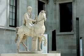
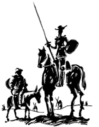
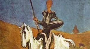
Morning Matt, a developing notion, dependent on whether I can pull another song out of the withered sack - oooh - Caligula (Bootikins), dissolute, astride his beautiful steed Incitatus, staring balefully at the 'camera', maybe just a hint of Don Quixote on Rocinante in that neither he or his mount are quite as grand as he imagines.
On a gumtree hunt for good old frames for some of your prints, loving this treasure trove. Plus stickers and badges, the way to any nerds heart. Thanks again.
On 20 May 2017 5:46 pm, "GAR"wrote:
I'm firming on Bootikins as a title. The more I live with it the more I realise that many of the songs have different shades of the same fascinating and distasteful customer who is part my worst self, but more so the worst we have within us expressing itself too freely now. Which is not new, just the reddest, rawest rim of the cycle. Here are the words to the track. Keep well, and keep enjoying.
Cheers G

Hi Glenn
I'm back into the swing of things at home...... mostly.
I've been bouncing and colliding visuals around in my head based on the most recent cover ideas, images and lyrics you sent through. I keep coming back to 3 possible approaches, which I thought I'd send through basic descriptions of before I sketch anything up.
1. The main idea I keep coming back to is somewhat ridiculous, maybe too much so, but I think it combines the juxtaposition of how Caligula sees himself and how he is seen by others. I was thinking we could have him sitting tall and proud in the saddle, looking very regal and charming. However he could be seated on a pantomime horse (perhaps having the person in the rear of the costume peeping out of the gap between the front and back). It's an extreme clash of visuals, but it's certainly unique :-) I could illustrate it in an older inking style, giving it a look that's a mix of an old etching and something from Alice In Wonderland.
2. We could have Bootikins riding across the cover, with chains attached to his horse than drop down to reach the ground and disappear off to the right side of the cover. On the back cover we could see 2 poets carrying a large book that the chains connect to, writing on its pages as they walk.
3. Taking the front on approach we can see the figure atop their horse, slightly slumped and looking very heavy in their own skin. A shadowy figure. I've got an idea of how to capture this in a heavy and painterly manner, very inspired by the background screen on my laptop (from McKean's Black Dog, especially the right hand side).
So there's 3 more ideas to throw at the wall. Let me know what you think.
Hope you're doing well mate.
Matt
Hi Glenn
I've attached a file containing the 3 possible concepts. They're very quick sketches/mock ups but should provide a simple enough starting point for each of the ideas.
For the middle piece I've added some books being carried by one of the poets along with one being strapped to his back for the other to write into.
For the third design you can see the middle section where a man is peeping out, and there's also the hole in the front neck of the horse for the other person to see. For this one it could be approached so that the horse is obviously fake and pantomime in nature, or it could be made to look much more realistic aside from these gaps/holes, which would be quite a strange visual.
Let me know if you have any questions or if you'd like me to start to put tighter versions of any of these pieces together.
Hope you're well.

On Tue, Jun 6, 2017 at 9:38 PM, GAR wrote:
Quite enamoured of the first, has a dramatic something, but also like the panto idea of the 3rd. Bathetic I suppose is what we're after, which means there needs to be some residue of a greatness and heroism but in its failed state, which might be somewhat comic but hopefully equal parts tragic. And the result of him coming to know this state has him seething internally, but he won't show it if he can help it - it reveals itself in his outward show of disdain and menace. Of course none of this needs to be told or really even shown in detail, the trick (the art) will be in conveying any and all of it with a deft stroke! I already get it a bit with the pose of the first piece. Digging it Matt.
G
Hey Glenn,
For the first piece, to try and capture that bathetic mood we could have the paint and textures be fading and crumpled, falling apart. I can also adjust his pose to give him a weaker, more slumped in the saddle appearance.
For the panto approach we can play up the trashiness of the horse, have it being an old worn out costume, lots of stitching holding it together. Dirty bare feet appearing from underneath the horses legs, etc. For this one it could maybe work to have his armour be laying discarded on the ground on the back cover?
If you like I can start to properly work up both of these pieces and see how they go. If one ends up being suitable for the cover the other could be used for something else (t-shirt or other merch).
Cheers
Matt
Hi Glenn
I'm nearly finished with the texture build up on the canvas for the painting. Got some work done on the panto illustration, fucked it up by smudging it but kept going for the central areas so I could fire something through to get your thoughts on it. The actual piece will be larger so I'll be able to get some finer detail into it all, let me know what you think, especially in regards to his posture and pose.
Hope you're well.
Matt

On Wed, Jun 21, 2017 at 9:44 AM, GAR wrote:
Hey Matt, I love this. Panto Horse is beautiful, and Caligula is pretty much perfect. Gleeful menace, he's passed through enormous grief, has established his philosophy well and truly, suffers increasingly from brain fever but delights, when he's able, in whimsical adjudication atop his steed. It's a great pose. Reminds me just a little of the genuinely scary giants from Attack on Titan! Very exciting. I'm interested in what tones you've worked up. I'm sure you're already well progressed but when I was in Naples at the Archaeology Museum I was astonished by some of the Pompeiiean frescoes they'd salvaged - didn't realise how much there was and how advanced some of the techniques were - but for texture and ageing they're certainly ballpark. Great stuff man!
G
OCCASIONALLY MATT AND GLENN WOULD SHARE ANECDOTES CONCERNING THEIR WORK OUTSIDE THE ALBUM COVER, MATT’S ARE REDACTED FOR PRIVACY BUT GLENN’S ARE FASCINATING AND BITTER, LIKE A GOOD NEGRONI ON A BLISTERING HOT DAY.
On 26 Jun. 2017 9:25 am, GAR wrote:
Jesus man, really sorry to hear about this. What a fucking prick. It's not the most valid comparison but it does remind me of the times over our career when the person we'd been working with at a label was suddenly fired or promoted and all the plans we'd made, budget etc went out the window and we were shuffled back in the queue behind some Oz Idol muppet or Delta Goodrem what have you. As if being a creative, and I mean that in the way it used to be used, isn't precarious enough you have dolts like this guy who obviously didn't run his business well holding you to ransom. There's a whole couple of generations growing up observing that being a complete arsehole, ruthless, unkind and selfish, is the best way to get where you want to be. And sadly they don't appear to be wrong.
I might need another coffee...

On 29 Jun. 2017 6:33 pm, GAR wrote:
Stunning Matt, I really like (and fear) this figure, starting to feel like he's becoming real. I can also see details being appropriated for more prominent use. I'm inclined toward the ink but love the woodcut also, I'd defer to you and what you think will be most effective in terms of what you can work into it. I'll give the colour some thought and get back to you as soon as I can.
Cheers G
Hey Glenn,
I find myself imagining the people inside the horse suit verbally taunting Bootikins as they ride along haha maybe that's just the mindset I'm in with all these publisher woes.
I think the ink piece will sit nicely on top of the textures and some inkwash/watercolour. The chisel tip style might actually work well incorporated into the painting a bit as it plays into the abstract details nicely.
Cheers
Matt
Hi Glenn
Started to play around with some potential approaches with the illustration. Just throwing things down digitally to see what works. Textures on the canvas are all down and dried so I'll be able to start laying down some paints soon on that one.
Hope you're well.
Matt

On 6 Jul. 2017 7:35 pm, GAR wrote:
Dig it. Sorry I didn't get back to you regarding textures/colours but you're close to what I was thinking - the ochres, terracotta, black smokey smudges, blood reds, maybe occasional azure - pompeiian colours. They do a good job of approximating what things probably looked like in 'Rome' the series, which is a great watch if you haven't seen it. Looking awesome. I'm buggered, been tackling several fronts at once but getting a lot done and feeling pretty positive about things. It's getting so that I'm viewing this weekend - tax weekend - as a bit of a holiday! Hope you're well too Matt.
Cheers G
Hey Glenn, glad you're happy with the direction it's heading. Once I nail it down digitally I'll be transferring the artwork onto the textured papers to create the whole thing as a single piece to photograph.
I've started applying some grit and tone to the canvas. Tweaked the figure a bit as well for what will be the painted version and attached a sample for you to check out (Just basic line work, the final will have some lovely heavy shadows). Shifted the angle a little so we can see a bit more of the horse to add more weight to the image. This also gives is a better view of the rider and their posture.

AWKWARD EXCHANGES HERE AFTER GLENN GOT POST TAXES WEEKEND DRUNK AND SENT MATT SEVERAL ONE WORD EMAILS ALONG THE LINES OF “MOVED” “BALLSY” AND “TRIHJKL”. MATT RESPONDED WITH AN ABSURD AND DOUBTFUL ACCOUNT OF PURCHASING A COMIC CALLED “BATMAN VS ELMER FUDD”. BACK ON TRACK AFTER THAT, FEELING LIKE THE RELATIONSHIP HAD SHIFTED A FEW DEGREES TO THE PECULIAR.

On 18 Jul. 2017 5:51 pm, GAR wrote:
Sometimes you really want to write these words, "get fucked". Just gotta have your ducks lined up first.
Anyway, negative energies and all that. Great to hear things are still moving, and very much in line with the record which is 3/4 there and just waiting on me to apply my own idiosyncratic, (read amateur), and frequently 'surprising' mix to the last 3 songs before it can go to mastering. I dig the grim, almost heroic were it not for the malicious glint in the eye, Bootikins, although his ‘mischievous and unhinged’ from an earlier horse bound one is still how I see him most. Camus' Caligula is worth hunting down at a library, shortish play that depicts him almost sympathetically as a philosopher king, albeit an increasingly demented one. I don't think that's quite who this guy is though, you're on the right path with him, there's a bit of a gangly scattered teenager in there with that Quixote element as well. A brand new Caligula methinks.
Cheers G
Hey Glenn,
That's great that the album is so far along, I can't wait to hear it! I should have the ink/watercolour on paper piece finished next week, and the painting probably has another few weeks to go on it, then I can take it in to get photographed.
Were you wanting me to help assemble the digital files/text etc for the album as well? I'm happy to do so if you don't have anyone else who normally handles that.
Some underlying sepia tones and aging taking place.
Cheers
Matt

On 19 Jul. 2017 5:12 pm, GAR wrote:
As for the text side of things we have a guy who works with the distributor who does all of that and he's got it down to an economical art with all the formats and then postering etc so it's most appreciated but best kept in house at Caroline. That doesn't negate actual font design and choices at an aesthetic level. We'll get on to that soon but worth keeping in mind, my top of the head thinking is somewhere in the realm of a gothic invasion of the roman classical with some kind of decrepitude but that's my metal roots showing.
Love the sepia texture, bit of rust, bit of decaying metal bolt crying into stone. Verdigri'd brass might make its way into that...
LIFE AND DEATH RUDE INTERLOPERS AS EVER.
On 3 Aug 2017, at 7:32 pm, Matthew Dunn wrote:
Hey man, hope your week is going well. Attached the latest progress shot, refining bits and pieces, removed the reins as they seemed at odds with the rest of the image, hope you don't mind that change. I had to restart a big chunk of it as one of the medium layers I'd applied didn't work as it was supposed to with the ink, but it's back on track and getting closer to the finish line. A lot of this progress stuff ends up buried under so much more ink and paint, but it all adds extra depth and tone to the piece. I've worked in a more solid layer in pencil work under it as well which gives it a bit more weight on the canvas.
Anyway, that's most likely just me rambling away in an effort to convince myself that I know what I'm doing at the moment.
Cheers
Matt
On 3 Aug. 2017 8:39 pm, GAR wrote:
It's beautiful Matt. You'll have to bear with me, some upheaval last few days. Not my usual expressive self.
Tony Cohen, our engineer and mixer for some of the best stuff we've done for ages, passed away. I'll get back to you, sorry Matt. Just got to be down for a bit.
On 3 Aug 2017, at 11:44 pm, Matthew Dunn wrote:
Ah man, I'm so sorry to hear that Glenn. My condolences and thoughts to you and everyone else touched by his passing.
On 3 Aug. 2017 11.49 pm, GAR wrote:
He’d been a bit ill but he'd made a habit of coming back from things so it was a cruel shock when he didn't this time. He did really great work with us and his contribution and yours are two of the highlights of the project.
On 3 Aug 2017, at 11:52 pm, Matthew Dunn wrote:
Thanks for the kind words Glenn. It is a genuine honour for me to be a part of the new album. The whole experience has been a source of creative and personal inspiration and I can't thank you enough for inviting me to collaborate.
I was reading an article on Tony today, the man was involved in so many amazing albums, truly remarkable.

THANKS TO MATT FOR HIS BEAUTIFUL WORK AND DEDICATION, PLEASE SEE OUR BOOTIKINS LYRIC VIDEO AND ONLINE ART FOR MORE OF HIS WORK AS WELL AS VISIT HIM AT www.matthewdunnart.com
GRAB A VINYL COPY FOR THE FINISHED COVER ALONE! MUSIC IS OPTIONAL, BUT RECOMMENDED.
Also available, THE ART OF BOOTIKINS, an A5 sized booklet showing the creative process behind the Bootikins album cover, designed by Matthew Dunn.
